Case study KPI Dashboard
BI solution for all of the Component Services Plants to check the status of the supply chain. This solution provided one single place to monitor the complete supply chain and some supporting processes.
- Year
- 2021-2022
- Role
- BI Specialist
- UX Designer
- Client
- KLM Engineering and Maintenance
- Skills
- Data Transformation
- Front-end development
- UX design
Background
In July 2021, I joined KLM as an external Business Intelligence (BI) Specialist with a foundation in User Experience Design. I joined the KLM Engineering and Maintenance (E&M) branch Component Services (CS) Department. They had a problem with their dashboarding solution. All their data comes from different systems that don't speak to each other, there are dashboards with similar information but with different outcomes, and there is no clear overview where to look for what information.
Component Services is, next to Engine Services and Airframe Services, the branch that maintains and repairs "components" from KLM airplanes, and airplanes from various customers. A component is everything that is not the engine or airframe of an airplane, so some examples are: Wheels, Emergency slides, Coffee makers, Ovens, Seats, Cockpit computers, etc.
The Problem
The solution was to solve some issues the business was having.
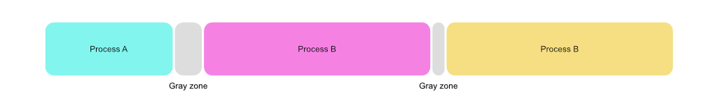
- Grey zones: parts of the supply chain where seemingly no-one was responsible. These grey zones were up until now invisible and should be made visible.
- Fragmentation of data: the data was scattered in a variety of different systems that do not --and could not-- talk to each other. It was our task to bring all these systems together in one solution to give a complete overview of the supply chain.
Because of the scale of this project, it was my personal goal to make sure users never got lost within the dashboard. Also looking at previous attempts and other dashboards the company made prior, it was very easy to get lost because there was no clear structure.
The Users
The user base initially consisted of the EVP and MT of Component Services. The MT consists of all Plant Leaders like Component Repair, Component Availability and Supply Chain Operations.
Over time the user base expanded to include the team leaders of each plant. With this increase it was important that navigating the dashboard remained easy.
User Research
Research mainly consisted of interviews with the users to find out what they wanted to see in their respective section. The Component Repair plant was the most involved in the development of this dashboard, which reflects in the amount of solutions we built for them.
Throughout this project we realized that just accommodating user needs is not always the best approach. Sometimes is necessary to challenge their ideas to find the best solution that benefits the entire business, not only their part.
My Approach
When we started this project I tried to setup a clear structure how the navigation within the dashboard should happen. Because of how many different departments will use it this needed to be easy and clear to use.
1. Hub and Spoke
In my Games and Interaction studies, during the Level Design classes we learned different ways of level structures and the pros and cons of each of them. One level design structure is called Hub and Spoke. Where there is one central area (the hub) and spokes to other levels, but the player always returns to the hub to go to the next area.
Given how the Component Services (CS) business is structured, this seemed to be the right way to tackle this problem. One hub page with the highest level metrics and links to pages to give more insight into the plants.
2. Page structure
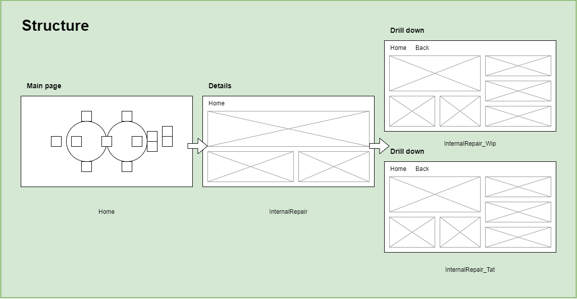
To make sure there wouldn't be endless levels of pages, I also thought on how Apple (used to) make their settings menu. They have this philosophy that you could never go two levels deep in to a setting. I implemented this in our dashboard as well. So, from the hub page users could navigate to "Detail" pages and from there to "Drill down" pages. This seemed sufficient with the amount of data we wanted to show.
3. Multi-dimensional
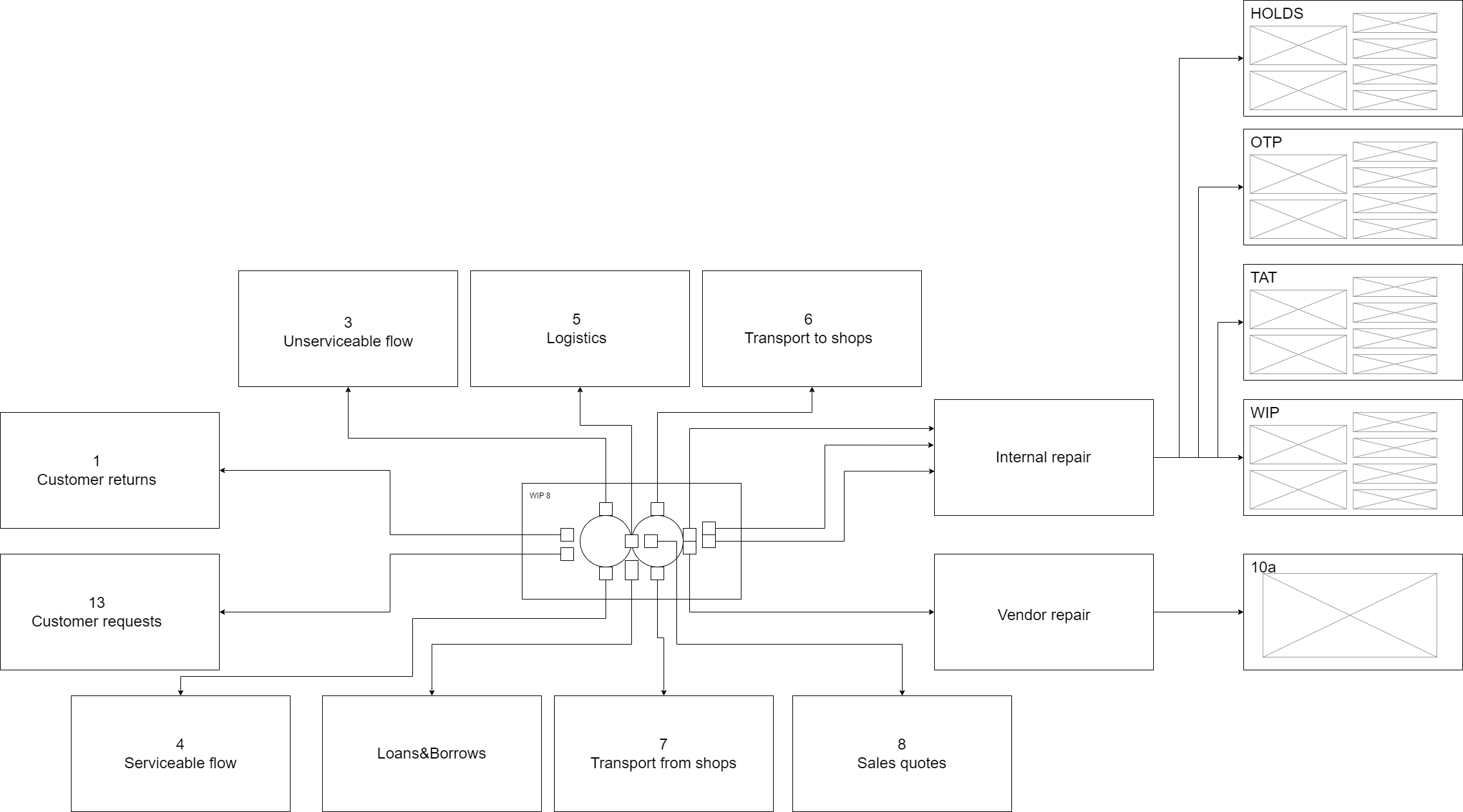
In the images above, you can read terms like "WIP", "OTP", and "TAT". These are acronyms that are widely used internally and mean Work in Progress, On Time Performance, and Turn-around Time respectively. These are the main metric the business uses to measure their performance and are critical for the process.
To facilitate this, we designed the dashboard that on any page, at any moment you could switch between the different metrics. On the Hub page, it initially showed the On Time Performance, as that is the KPI of each department, but you could easily switch to TAT or WIP if you desired.
Outcomes and results
The resulting dashboard gave the business one place to follow what is happening in the supply chain. While it was still very hard to make the systems speak with each other, there was at least one place where all the information was presented in a simple way.
We also solved the grey area problem by enforcing different measuring points. We told the different departments between which timestamps we were going to measure and why this was better. This took a lot of convincing but in the end the business is better off with this new approach.
A happy accident was that for the Repair Shops specifically, this dashboard helped them make their weekly performance meetings more efficient. Where before they needed to dig up their performance numbers manually, they can now easily use this dashboard.
Lessons learned
As this was the first large project I tackled when joining KLM, I learned a lot on how to work with the business and figuring out what they want and need.
1. Hub and Spoke and Multi-dimensional design
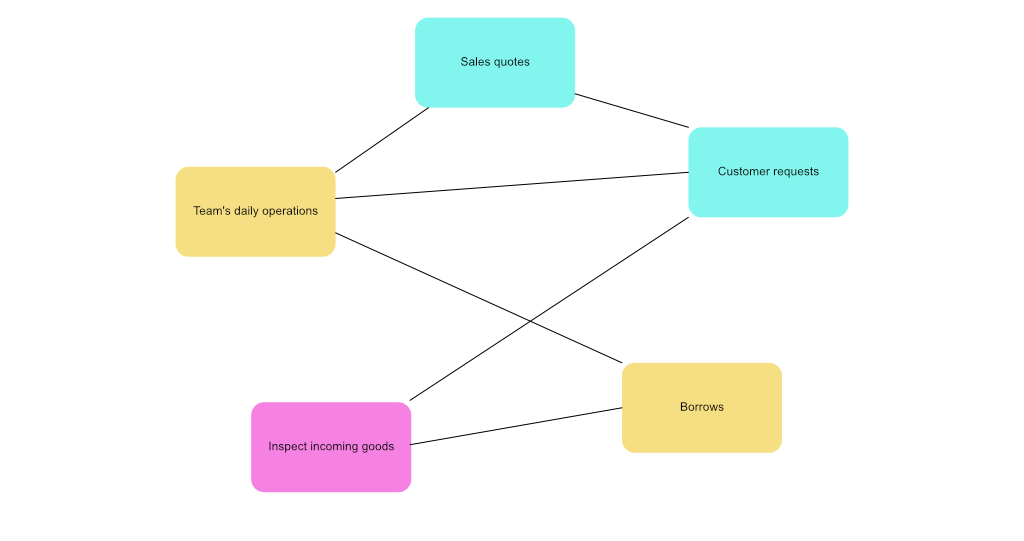
Initially I seemed like a good idea to structure the dashboard as a large hub and spoke as users only need information about their department right? What I found out is that certain information is department agnostic. For instance, both the Internal Repair department and Logistics can both be interested in Borrows, as they can both contribute to lower these.
With how the dashboard was designed most pages showed one "kind" of metric. So internal repair has their "WIP", "TAT", and "OTP" pages. But maybe you need to compare the WIP to the TAT to see the whole picture.
2. What I would do differently in the future
While it made sense to setup a strict structure for the dashboard when we built it, over time, we realized that conforming to this strict structure limits cross-departmental thinking (or how KLM calls it chain-thinking). We want to encourage the business not to think in siloes, but this design does not completely allow that.
Currently we are redesigning the dashboarding landscape (due to technological upgrades) and in this version I am planning to have a more scattered approach. Where we build standardized dashboards for activities rather than departments. And then link activities together that makes sense. This makes it feel more tailor made for each business user as they get access to the information they like, but more maintainable for us as we build the page only once and change some filters.