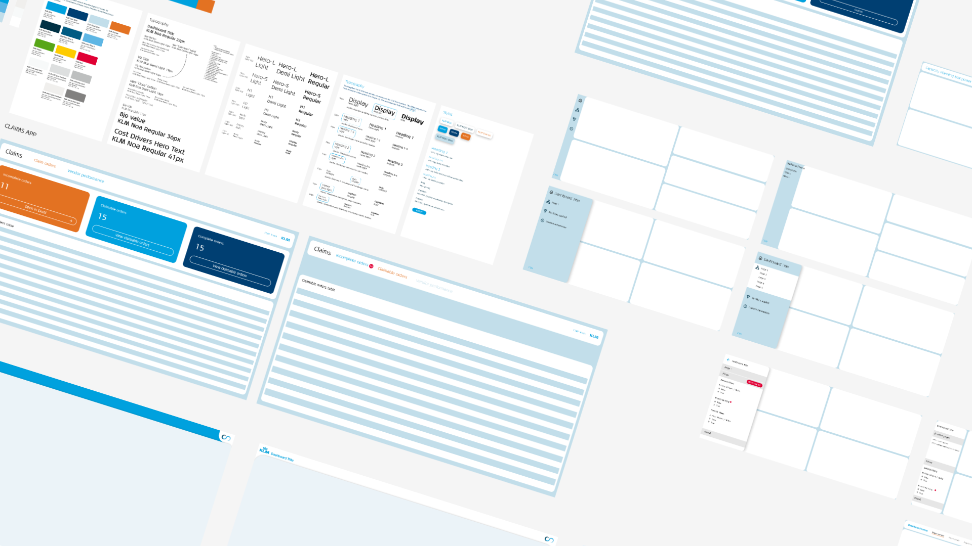
CSBI Dashboard Design System
A simple to use design system to quickly style dashboards for KLM Component Services (CS). More consistency for our users, easier to develop for our developers.
- Year
- 2021-2024
- Role
- UX Designer
- Front-end Developer
- Client
- KLM Engineering and Maintenance
- Skills
- UX design
- HTML, CSS, JavaScript
- Figma
Project context
Purpose
This design system was built to unify the dashboard styling within CS. Over the years, a lot of people built dashboards, all with different styling, not according to the KLM Style guide. To make it easier for the CSBI (Component Services Business Intelligence) team to quickly build dashboard with identical styling this design system was created.
Team Context
The CSBI Team consists of 6 people, where I have the sole role as User Experience Designer/Front end developer, in addition to my official role Business Intelligence Specialist. This design system was constructed by me, with the help of the official KLM Style guide for digital products. I tried to find the harmony between the official KLM style guide and what we needed for our dashboards and data products.
Tools used
I started creating the design system in PowerPoint, after which I quickly transitioned to Confluence. To make it easiest for my team to find the design system I decided Confluence would be the best place for my team to find and reference it.
In addition to the design system, I also made a template dashboard for my team as a jump-off point when starting a new dashboard. This template was in TIBCO Spotfire; our dashboarding tool.
For template 2 and 3 I used Figma, and most design elements were already in the Spotfire template.
Styles
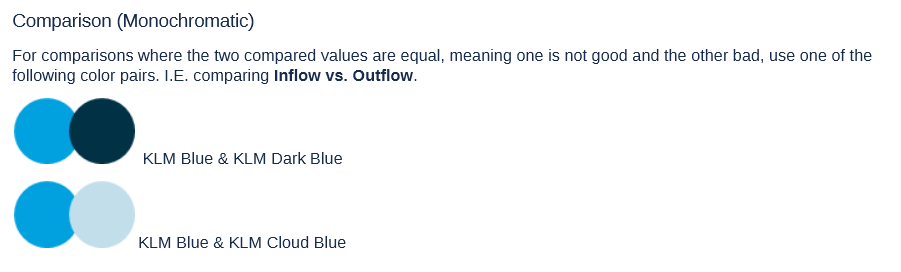
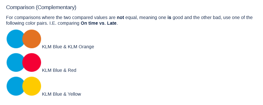
Colour palette
The colour palette is based on the official KLM colour palette. But I applied some colour psychology to try to make it more obvious for users to understand what colours mean. For instance, KLM Blue is always used for values with a positive connotation, while complementary colours (orange, red, and yellow) are used for values with a negative connotation.
Typography
Initially we used the official KLM Typeface Noa for all headers. In 2024, this Noa was deprecated and replaced by Universal Sans. From template 3 onwards, we used Universal Sans.
Elements
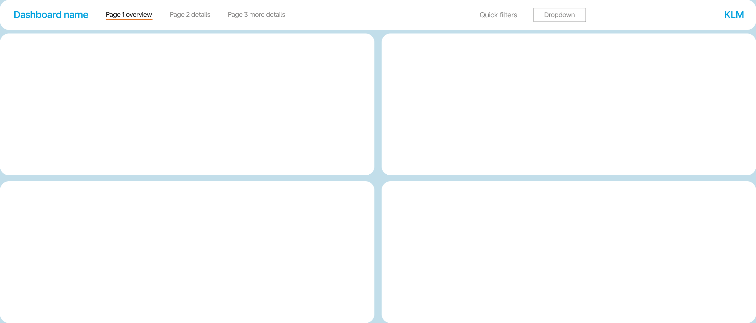
Menu bar
To create some visual consistency, I modelled the menu bar like the menu bar on the customer-facing KLM website. Simple buttons with a grey background on the hover state and an orange line when selected.
To save as much vertical space as possible, I made sure the menu bar fit in the smallest element Spotfire can render. Spotfire is a drag and drop dashboarding tool with the ability to add your own HTML, CSS, and Javascript. These custom elements are placed in "text areas", I made sure if you resized it to the smallest possible size, the menu bar will still be fully visible.
Modules
Developer shortcuts
To enhance the adoption by my team, I needed to make it as simple to use as possible. I did this by creating scripts that apply styling automatically. This made it easier to use my design system over the default behaviour of Spotfire.
One of these shortcuts was the automatic population of the menu bar. If you gave a tab in Spotfire a name starting with "_" it would automatically show up in the menu bar. This made it really easy to hide pages to our users. Pages that maybe needed to be visited by users but you don't want to show in the menu bar.
Another shortcut is to recognize if you are in the dashboard editor or on the web, and automatically hide the default tab bar. This always used to take manual actions, and was often forgotten. To dictate the user navigation, this was crucial.
Blue tiles - custom KPI cards
Spotfire by default, does not come with cards to display KPIs in. So I designed some that can easily be modified to fit any situation. These also use the forementioned text areas, so they can be fully customized to our liking.
Reflection
This showcase was a bit of a mix of parts of different versions of the design system, mainly version 1 and version 3 (we don't speak of version 2). Currently we are at version 3 of the Dashboard template. In the beginning I was very eager to over-design certain elements. But this sometimes made them harder to use. When I started to focus on making things easier for myself and my colleagues, the good ideas started to flow.
Also our users did not always care that much for all the fancy custom cards and timelines I designed, they often just wanted to see a bar chart. So over time I scaled back the custom visualizations and started to use the built in ones more and more, also improving maintainability for my team.
How I would improve the system
Version 3 is currently still very bare bones, it has a pre-styled menu bar, (and the forementioned automations) and that is about it. The styling of a dashboard should not distract from the information presented. So less is more. Make sure the brand colours and typeface are enforced, and make it easier for colleagues to use.
What I learned from version 2
The second template was meant to be the "all new and improved" styling for dashboards. What I noticed after a few years working with template 1 is that a lot of users were using laptops with very low resolution screens, mainly vertical resolution. I wanted this new version of the template to use as much vertical space as possible. This meant shoving everything in a small menu on the left hand side of the screen and keeping the full vertical height of the screen for data visualizations.
This meant that switching pages required double the amount of clicks, as you first needed to open the navigation panel, and then select the page. On paper this seemed like a really good solution, in practice it was horrible. To make it even worse, users could not easily find where to switch between pages. So, I quickly reverted to a top menu bar, but made it much slimmer than version 1.